Friday, 16 July 2010

Today me and a few students in the class watched horror trailers. We found it very effective because it helped us understand what small details can make the trailer effective. Eg paranormal Activity they show a baby flash then the babys gone but still in the mirror reflection then Hostel II that just had minimal detail, all it showed woman screaming and a variety of torture weapons, we found thats all it needed to freak us out and it explained everything to us.

This made me think that when it comes to my horror movie trailer, that there is many ways to get your point across to the audience.

Font makes a big effect because it reflects the sort of film it is going to be eg. the horror film font would be big,bold,ragged,red,twisted etc. 

Pete Frazer

Pete Frazer was an examiner that came in to help us understand about A2, he taught us different ways in which we can blog to gain more marks eg. video our anwser, use prezzi etc.
He showed us some of the last years blogs which we all found quite fascinating, it was interesting to see different peoples perspectives on blogging and different perspectives of creativity. One video that struck out to me was the dance video, i found it very intriguing not only because it was different BUT it actually looked like a proffessional video. The use of camera angles, mise-en-scene, editing etc was perfect. They also used videos to record their anwser so they was in a room where they all sat down together read out the question and gave their different anwsers.

Another video that was shown was where when they anwsered their questions they used flash back images or mini clip to show what exactly they was talking about, this was quite impressive and creative.
From looking at this blogs it made me think outside the box and open my mind up to different ways of blogging.

Pete Frazer got us to talk about our project we did for AS which was blogging and designing a magazine. He asked us to create an island in which we will create images and writing to show how we felt our journey went whilst doing this. Many people had the same views on the different aspects. We deliberated about it in a class discussion, it got us to exercise our minds and understand why we found things hard and how we could help prevent that in the future.

Alot of class discussion went on about blogs and our opinions on the ones we viewed. It was interesting to see how different everyones mind worked, because not everyone agreed on the same thing as everyone else.

To round off our lesson with Pete Frazer we was asked to draw out our version of a english breakfast, we was shown videos from youtube on people explaining how to make one, Pete got us to watch that that video so we can understand that blogging with videos is just as sufficent.

Once we all created our ideal english breakfasts Pete pinned them up on the wall and each group explained what they had put on their plate. I think this was a way for Pete to show our individuality. There was a lot of similarities and mild differences.


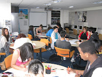
This is an image of us in class with Pete Frazer
Wednesday, 7 July 2010

PREZI


I researched the site prezi (www.prezi.com) and found out what it is about. This site allows you to edit presentations, it allows you to access different links from one page instead of creating 10 or more slides. It is a more creative way and makes it funner. You can add links to other websites or youtube. You can also add pictures to tell your story then add a little text next to them. You can present your presentation differently eg. you can create it like a book then speak your thoughts on what you did and add images in to make it more intriguing.

The presentation allows you to zoom into different sections and then click on that topic to enter this subject and get the information you want to know. It is easy to access all you have to do is click and then you are able to zoom in to what you want, when you click on the area you want it the slide would move itself to were you want it to go. Its a faster, more interesting way.

This link will show you how it works:


I would like to use this site in the future to explain how i did my trailer so i decided i would create an experimental Prezi

I found it quite easy to actually do, i was able to add images change my font and the size. I could rotate text and images.
They show a mini clip before that shows you how to use it properly.

This is a video of my experiment on the Prezi site.

In order for me to download the video onto my blog i had to download the presentation onto the desktop and then i was able to download it onto my blog. When i tried it, it didnt download, someone in the class then found out you had to enbed it in order to download it onto blogger.

This is something new i have learnt today how to use the Prezi site. It was quite easy the only difficulty i found was figuring out how to get it onto the desktop but i soon enough worked out how to do it although it was not needed.

BACKGROUND

The reasons for this background is i feel it creates a olden time scary atmosphere, this therefore puts emphasis on what my movie trailer would be about.
I find it quite intriguing because the images in it are quite different. The image is not a typical scary picture, it just sets a scary atmosphere which in all horror films it shows an establishing shot that shows the setting which can also be like the image i have used.