Thursday 16 December 2010

EVALUATION

Q: What ways does your media product use,develop challenge forms & conventions of your media product?

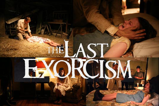
1.We decided we will keep the music quite simple but sinister, this is our way of challenging horror film trailers that involve young teenagers because film trailer tend to go into depth about the characters lifestyle establishing where they go everyday and who their friends are etc. Instead of us doing that we decided to show images which we feel makes the audience think wether or not this person is dead or is going to die this is our way of getting straight into the action and keeping our audience alive and focused . We then chose to do a voice over which is of two reporters explaining deaths of different victims on two different occasions. We did this to explain to the audience what has occured but we have kept the information quite minimal. When looking over teaser trailers we learnt a lot of shots are not actually in the film so we used this our advantage and created shots that would not necessarily be in the film. We kept our words minimal because we felt it creates more realism and creates this interest to the audience. The words we did use are very formal which does adds a sinister atmosphere .We created this two shots that switch over, one of a woman walking in red heels and another of a clock, We did this to keep this sense of urgency in the trailer and this intensity most film trailers don't really do this. I feel we challenged the way the feeling of horror can come through and have shed a new light. Throughout the shot we still have the sinister music in the background but also have a ticking clock. The use of the slow motion and the ticking clock creates this big suspense. Throughout the trailer we have kept the location to a minimal unlike other trailers this is to keep it mysterious and make the audience gets this sense of no where is safe. We use words in places that are neccessary so after the clock shot we use the words "You cant turn back the clock" this is to show the audience when your time is up, its up and you can't escape this killer when she wants to get you.We really have tried to speak to the audience through our trailer to make them feel involved. As we go on through the trailer this is where climax really builds up. This is where we have shots of running, we tried to keep speech to a minimal because we did not want to explain the story to a full extent because our film is the second so the audience would already know the basics. Instead we decided we would have fast quick shots to build this intensity. We made the music build up by including a thunder noise and this ghostly voice enters to create the atmosphere. We kept the shot quite jiggedy to create this sense of confusion and metophorically how fast the characters heart beat is racing.

The last shot we make the sounds build as we see a girl trying to create some light we used the technnique dramatic irony as the killer peers behind her and blows out the light and we end with a scream. We challenge conventions in the sense of we show no personalatie to any of the characters but this is our way of keeping everything mysterious and more intriguing.
As the production details carry on the sound of the climax still builds up and the clock starts up again, the use of the clock shows midnight is over the killer has now got another 24 hours to kill another and cycle will continue. The climax build up carrys on to a black screen this is where people will expect something to jump out at them but we challenge this by not doing that and leaving the audience wanting more.

Q: How effective is the combination of your main product & ancillary texts?


Q: How did you use media technology in the construction & research, planning and evaluation?


Q: What have you learned from your audience feedback?

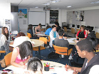
4. We used technology in many different ways to construct different things for example the trailer and research. We firstly used a video camera which without we would not be able to create any footage. We used video camera facilities such as a tripod to create height and different shots. When we achieved our filming footage we used apple mac computers to transfer the data on to a software which was called iMovie. This allowed us to edit the footage and add sound, text and images. It was a fast way of creating a proffesional looking footage. On iMovie we was able to rearrange the sound orders to how we wanted it for example the sound to get higher at a certain point or lower. In our trailer we used this technique. When researching for our trailer we had to use the internet to discover how other trailers use images, sound and footage to create this realism of horror. We used Itunes to do so as it allowed us to watch trailers of upcoming horror movies. This allowed us to discover how we could go beyond the 2010 techniques and create a wider audience with a original unique selling point. We used google to research film posters. Once we picked ones we feel related to our trailer the most we used power point to create slideshows to compare and contrast them so it was organised for us to see what we could possibly use to make our film poster as fufilling. We also used a video camera to research, we went around to certain areas of the school and recorded what we feel could come in handy. We went into the prop room in the drama department and recorded freely what we think could be used to help create the setting of this horror movie.We then went on to record two members of our group interviweing a different variety of people from age and gender to see their views on horror films. We then went on to planning/ researching by using our chosen settings and going into there with a camera and recording how we could use the props we found and put them in this chosen room to set our scene to life. This was effective because we went into depth with the rooms and how everything will be laid out this allowed us to know if it will work or not. We was successful when recording but the dark room we did not use because lack of light. We used a digital camera and phone camera and went around to different potential settings and took pictures just so we can decide what ones we feel will work best and are easy for us to get to and suitable for school/weather/students.
FINAL TRAILER


ENJOY AND DON'T BE SCARED ;)

AUDIENCE FEEDBACK


I used this slideshow presentation to show our audience feedback on our trailer and poster images.
We uploaded the trailer on to youtube as shown above and was given some posotive feedback.
We also made a facebook group for our whole media product and got some postive feedback on our film poster.
I made a twitter acount to keep our audience updated with what we have been doing to create this wide publicity.

Tuesday 14 December 2010

Today we completed the last needed details to our trailer, we changed the type of font throughout the trailer and included the production details. This took us roughly about 45 minutes. We then moved on to put everything in the exact correct parts of the trailer this mainly consisted of the sound. We have quite a lot of sound throughout our trailer and when adding something in to edit the sound gets moved so we had to make sure it was precisely where we wanted it.

We showed our trailer once again to audiences and our feedback was much better, they was very impressed with the use of sound and images.

The key question for me & my group was at the end the music's suspense really picks up and we don't know wether we should put something in or leave the audience waiting. We decided to choose leave the audience waiting because we feel it creates that suspense as to, what happened? It makes us feel people would want to know more so go to see it and thats our goal achieved. When we watch it back we even feel the suspense and we know what to expect so the audience not having a clue means it should create a really big affect.

Wednesday 8 December 2010

TRAILER EDIT


Todays lesson was very productive, we looked over our final piece of footage, placed everything in place with the backing track.
I feel our piece of footage has really come along although there does feel some things are missing. When showing it to the class we got some audience feedback and these we have all taken into consideration.

There is some text in our trailer; the font we have used sort of down grades our 'classy' trailer & makes it more of a monster gothy horror which makes it look less mature. I think once this is sorted it will make our trailer look complete.
In order of the sound we need to add that little bit more of a climax, everything is sort of soft until the end but there is not that big bang that gets the audience so me and my group are trying to think of what could be used to make the film trailer stay in the audiences mind.

The last thing we need to do is the production details at the end:
The film title
The release date

Friday 3 December 2010

When deciding the film poster we was having a quite a dilemma because of the pictures we was deciding to use. We had taken some photos before but then noticed we did not have anything to resemble our trailer so we decided to take it again. Our first image we took was by a grave stone, on one side was a pair of converse and the other side was heels to resemble the antagonists. Because this didnt really give away the concept of our film we had to re-do it and look more in depth.

We started to think what we would like to see in a film trailer in order to intrigue us and make us want to watch it. We decided using one of the actresses in the film trailer as our picture and adding the small details it will work effectively. We decided to bring in the mask & the lipstick because this resembles our killer.
We used text we feel would be quite scary but not a cheesy scary. We tried to keep the text quite minimal and focus more on the image.
We edited it in a way which creates realism and not cheap as the costing of the film mainly determines the quality of the film.

Friday 19 November 2010


When looking at this poster you automatically get a sense of horror. I feel when comparing it to a film poster it has quite similar identity's. They all have a resemblance as to what the antagonist or protagonist would be like. In my films poster we show this feminine killers mask and a girl with blood on her arm standing by it with a look of terror. This creates the intensity because your intrigued as to what this film does to make you scared.

We showed our main actors name because actors tend to be part of the main selling points for example Valentines Day involved a wide variety of popular actors.

The image of the bloody hands moulded in on the side give away the gory sense.

In saw it shows the protagonist mask and part of the victim, the fingers. Although both of these posters show a mask and a victim or part of a victim it still creates this mystery.


Friday 22 October 2010


FILMING


our first shot of filming was quite difficult, we had our location but it allowed to much light to come in through the windows so we had to think about how to cover it. We got some black sugar paper and covered the windows with it, we decided to use brown duck tape and white masking tape. We made these visual for the audience because we felt it would create a sinister effect. We filmed me running, we did many shots. We did a shot of me running towards the camera and a shot of me running away from the camera. We also did tracking shots from the back view and front view. We also did a tracking shot of my feet. By us having this variation we are able to choose what we want from what we have without having to film again because we do not have the correct shot. Approximate time it
took- 2 hours.

Once we was used to the camera the rest of the filming was not as hard. We decided we want to involve quite a lot of running shots to keep the trailer mysterious. We decided to do the same thing as above but with different characters and do a panel shot to show the face of the person, this was to make the audience feel intense at their facial expression.

Although we wanted to keep the trailer quite mysterious it wouldn't really work if we just had running shots so we decided we will explain the story a bit and thats where we filmed the reporter shot. This pieced the trailer together and explained what has been happening. Because there is a first film we was at an advantage because the audience would know what happened in the previous film so it doesn't have to be explained to the full extent.
We did a shot of photos so we could pin point our main protagonist, this was a way of us trying to make the audience feel scared.

PICTURES

We had many ideas for pictures we wanted to use for the film poster and magazine it was just about putting it into act
ion.

One of our ideas was to have the killer in the dark room having her hanging on the line by her arms where the pictures hang to dry looking dead. We thought this would be quite effective because we show images in the trailer and these images are who this killer goes after and by having the killer dead hanging on the picture line would be quite eye catching. When we tried to put this image into action it did not work because of limited lighting and limited space. Having no space made it difficult to get a good angle for the image and this just did not work.

We then moved on to another idea, this was of a grave stone with the killers feet on side (pair of red heels) and the victims feet on the other side (pair of converse). We thought this was a really good idea and when we edited it it looked really effective the only problem with this image was that there was no representation. We have nothing to show that this image was about our film so it did not have this full effect.

Because none of our main ideas work we decided to get a camera and take our main character and props and play around with angles and the props and facilities and try to create different images. We tried one of the victim lying down in a god position dead with a red lipstick kiss mark on her forehead. We also tried another one of her lying down with her arms crossed over her chest with lipstick smudged off of her lips.
We then went on to try th
e photo we have now used, this one came out as the most effective because it showed this horror in the characters face and the horror of the mask.
We also tried other photos, we put the mask at the back of my head so my hair was the face instead of my actual face, this was just a way of metephorically saying the killer sees everything.

When looking at the images on the computer we automatically thought the poster photo was the one to use and once editing it it was confirmed.
We did not know which one to use as the film poster the one of the victim lying in a god position was the one we wanted to use but it was too big and text would not really flow on the page so we decided the one with the mask on at the back of the head would be good. We played around with it and then ended up making the mask a half mask instead of the full image and this worked the best. It allowed us to have enough text to put story lines in and the masthead had enough room so it did not cover
the main image.
The other images we took we thought were far to good to just not use so we decided we would put them around the magazine to make it look more real.
The 5 S's

Script
:

Reporter- After the Dark room shot. * Mans voice*
Well spoken voice.

:" Im standing just infront yet *emphasise* another gruesome murder. Last night yet another murder was committed at the same time as two nights ago 11.54pm. A girl was brutly killed, she has thought to be..........

Reporter 2- *Speaking over* -- *Womans voice*

:" Another murder at 11.54pm---- Killed & left in this very place---

Reporter 3- *Speaking over*

: A woman was walking her dog when she found a girl covered in blood-- A lipstick print was on her left cheek.

Reporters- *speaking over* *VOICES ALL TOGETHER*

: "Some are saying this is a massacre!!!!!"


Shot list
:

: First shot in the dark room is going to be a mid shot over the killers shoulder to show what is happening.

:Second shot; shot of reporter is going to be a long shot this is going to be used so the audience can get a feel of the setting

: Shot of picture & clock is going to be a close up shot and is going to rapidly change between one & the other to create tension.

: Woman running is going to be a tracking shot this is going to be used to involve the audience by creating suspense.

:Killers face is going to be a close up to make the audience scared.

: The door shot is going to be a long shot, we decided to make this a long shot so that the audience can get a glimpse of the "protagonist" standing behind the victim, this is to create the dramatic irony.


Stock Characters:

We decided to keep the characters quite minimal we felt the use of props & locations would speak for them selves. The only form of characters we are using with speech is a reporter. This reporter is used to inform the audience this killing has been happening over a period of time & the people in the area are aware of the situation. We are going to use props to insinuate that a murder has happened or is about to. We are going to use a random victim to just emphasise the amount of killings. Our main victim we are focusing on will be a girl, we want her to be shown as vulnerable because when we are challenging our stereotype the killer is going to be shown as very strong & the contrast between victim & killer will be emphasised. Victims tend to be very vulnerable in horror films.
The killer will be very different from our usual killers we see in films. Our killer is going to be very femine she will wear a long cloak with red heels, red lipstick & long hair. She will be wearing a femine mask to keep the mystery alive. Masks tend to be used in films to do the exact same thing & me personally i feel it keeps the story more alive when you dont know who it is. For example in the film "When a stranger calls" the man was not wearing a mask but his face was never revealed to the camera. Every other aspect of him was apart from his face & to me as the audience i felt this kept the suspense and intrigued me more.


Schedule


We decided to work out what days would be best for one another and how long do we think it will take. We firstly thought about costumes, we haven't just yet bought everything or gathered everything needed so we thought we are going to need to dedicate one day to do this. We decided Monday would be best as it is the start of the week & means we can get on as soon as possible.


costumes:


Costumes we need are:


: A mask that would be used for the killer


: A cloak which will also be needed for the killer


: Golden Syrup or caramel sauce, red food colouring, green good food colouring which is ingredients we found on wikipedia where it gave us a way of creating fake blood.


: Red heels which will be used for killer


: Red lipstick which will be used for killer


: Normal clothes for victim (Jeans, top)


: Suite for reporter


Props

There are many props needed:

: Candles, Match sticks, Torches etc these are forms of lights we will need to create the sinister effect in the dark.
: Yellow plastic numbered pieces for when the reporter scene is on to show a killing has took place.
: Red pen for the killer to circle victim.
: Red blanket to show a body being covered.
: A microphone for reporter

We are hoping that the majority of these props & costumes can be found in school facilities or if not there one of us might have it, if not we are going to have to put money together & collect the left over items needed on Monday.

We decided to plan out scenes that relate to each other more. For example some scenes do not include the killer so we will put some that do not together & dedicate a day to the ones that do.
We set out our schedule not in the right order because we felt it would be easier the way we chose.

Tuesday we decided to do scene 1, 4 & 5.

Wednesday will be left to 2 & 7

Thursday will be left to 8 & 10.

We are hoping we can maybe complete scenes 8 & 10 also on wednesday but have split it up in this way just in case we can not.


Synopsis


Directors from Midnight Massacre are back in the game and have created yet another chilling horror.


A group of teenagers take a night off from the high school stress and rent a cabin owned by the popular girl Katie ( Jodie William). As a night of drinking, sex and and drugs goes on the danger escalates and the woods come to life. The nightmare begins as Jack ( Simon ballet) and Sophie ( Olivia rupez) get curious and seek out what is happening, when they don't return the others get worried and go to find the myth. They come face to face with the red killer who is a classy woman who will kill anyone who gets in the way of her chosen victim.


We went around the school looking for different locations. We found many places we found that could be alternatives. The pictures above are our chosen locations, we found they create sinister effects and could be altered to our likings.
The hallway that bends we have chosen to use is quite light & takes away the concept of dark & scary so we decided to use black paper to put over the windows to stop any sort of light coming in.
When thinking about locations we looked back at other films & how they create their sinister effect. A lot take part in a high school so looking at those films we can see how they use the facilities to their advantage.

The first few images are us doing our story board, this helped us organize how we are going to sort out the shots & what short type it will be.

Thursday 7 October 2010

Teaser trailers

Teaser trailers tend to be a 30-90 second clip which are used to give a warning to the audience this film is going to be realeased. Teaser trailers tend to be released about a year before the actual film comes out. They tend to be a lot shorter than the original trailer and give little information to what the story line is about but enough to highten the audiences anticipation. They tend to be used by high concept movies with big budgets for example toystory 3. This is a big budget movie and is poplarly themed. This trailer has only the characters in it, this is because the producers can afford to do that because this film is a popular film and everyone knows the characters already but it refreshes our memory on the characters relationships with eachother, this also happens in Princess & The Frog. This is a way of teasing us to let us know the new toy story is coming out, this generates a buzz.


Tron Legacy is another example of a teaser trailer, this trailer gives a taste to the audience to intise them. It utilises the enigma codes to much more effect. This trailer has so much mystery it makes you want to watch it to anwser your own questions.
It indicates a clear sense of genre and what the audience can expect from the production values. Although it shows a clear sense of the genre it doesnt actually introduce combat and violence or the protagonists in the movie. Like toystory 3 they both set a date at the end to get the audience excited.


Wednesday 6 October 2010

Iconography


Today i looked at Iconography. Iconography is the images and symbolic representations that are traditionally associated with a person or a subject. Once finding out the definition i looked at posters and their iconography. I answered several questions that involve iconography.

What is more important, Images or Words?


I feel they worked together to be equally important. Although i do feel images say much more to the story than the words for examples when you see a word for example DUE DATE you can get many different views as to what these words may mean whereas if you was going to have an image for example FRIDAY THE 13TH then you can see that it is going to be about a masked killer. Taking this information into account this means that the images will automatically give you an idea on what the genre will be. Words can have an effect on the film but it can sometimes be disguised and when it has no image to go with it it doesn't work to its full effect.

Some may argue that in fact the words do work to tell you what genre it may be. This can be the way the words are presented for example if it was going to be a horror it will be presented in a font that will give this away and maybe use a color that represents blood.The words also show a what we know as a "jinxed" day this shows there is going to be a lot of unlucky people involved.


Wednesday 29 September 2010


This is a video of me and my group explaining our planning task of a film called "Blood shed High".
We had to create a story board in which we drew pictures to explain the scene and then we wrote down the shot & the music that will accompany this shot.

We decided when talking about it infront of the class we would narrow it down so the class could get just a brief on the location, sound and target audience.
We had different opinions on some things for example the sound, we thought that we could use over lapping voices to intise the audience but then explained in the video that using over lap voices might just confuse the audience so decicded it may be better off not to.
SYNOPSIS


This is an evaluation i did of a synopsis from
"Sorority Row" This is also a horror film. I focused on highlighting the Antagonists, Stock characters, plots and Protaganists. I put arrows to the highlighted parts and explained why they are one of the above.


This is another synopsis i looked at, this is from the film "Let Me In".
I looked at what the two synopsis have in common and noticed they both firstly involve a lot of youth. They feed off the innocence of young people and make them become the Antagonist.
They also involve an Protagonist that seems to be a "Mystery" person.
They films both involve murder and both show before the film gets heated and the killings start there is some background information as to why the killings start to happen. They both involve someone has done something to another person and revenge is being seeked to teach them a lesson.

Tuesday 21 September 2010


Today we used this sheet to write down what we recognised in different clips of films from different genres. This made me realise that some films are easily recognisable in the genre area but some do overlap because of the Style eg. Romance
The genre was identified through different codes of convention for example the mise en scene used or the setting or the character. Themes also gave this away.
I felt this task for me was quite easy, i feel i am quite strong in the analysis department.
We looked at Clueless first of all. All the the characters, settings, mise en scene, themes added together to create this high school upper class teenagers who are interested in romance clothes & problems involving their "circle".

The one i found quite difficult to evaluate was the Western genre, this was hard for me because there wasnt much going on. It set the scene of a cowboy theme but it didnt have much props, its not the sort of film i am used to watching.


When watching this clip of grease we had to write our views on how it made it a musical. I felt that the way it was in a high school at a fun fair with all the "cool" kids, "Geek" & young boys/girls it sets the scene. The resoloution of singing & dancing about life is where it puts it all into perspective. This clip involved a lot of romance, fun, friendship & youth.


EXAMPLES OF OTHER MUSICALS


After watching the different types of genres, Musical, Science Fiction, Teen movies, Western, Horror, Comedy & Action/Adventure I noticed they all have an important setting in which this setting tells the story. They also have characters that set the film.

Looking at these clips it made me realise the importance of every small detail, this will make me think outside the box when putting my horror trailer together.

Wednesday 15 September 2010

Today me & my group got together & each gave ourselves 10 minutes to write down the ideas we had come up with the night before. Once we wrote down our ideas we took it in turns to share our ideas. This was a good idea because we gathered bits from different ideas to create our whole concept.

We completely changed our location into a house. We decided to make a story board so that we have on paper our idea & we can easily adapt if needs be.

Tuesday 14 September 2010


Whats the purpose of a trailer?

To interest the audience
to give an insight what it is about

Why do people go and see movies?

There is many reasons for example:

  • Genre- type of movie, everything visual will define the genre
  • Sequels become important also this makes the audience want to watch the second movie.
  • People can go because of actors for example the Expendables, the actors sell the movie also the director Sylvester Stillone
  • Narrative, The story becomes important.
  • Unique selling points are very important, For example Step Up 3D, this is unique because its a dance 3D.
  • Some people just want to watch movies for pleasure
  • Publicity and film reviews become interesting
Conventions of trailers.
What do they do?

Scott Pilgrim Vs the World

  • This trailer excites you by the images.
  • This trailer captures the best moments in the film & brings it all together in the trailer.
  • The trailer is very quick & snappy
  • The non diegetic sound sets the scene
  • Use of titles & credits.


Let Me In

  • Movie aims for realism thats why it uses words not a voice to tell the story.
  • More about creating a shocking mood & atmosphere
  • The unique selling point in this trailer is the 12 year old girl being portrayed as a vampire & not innocent.
  • The blending of Genres
  • Production details-Film ratings
  • Credits to express narrative
  • Medium to close up is the main shot type, shows its the more emotional based


My Dog Tulip

  • Shots are more pensive, they want you to look at the shots longer.
  • The use of the voice tells the story and explains the characters


All these trailers hold some conventions, they all show the best bits of film from beginning,middle & end. They all consist of credits, involving directors, reviews & release dates.

today me & my group wrote on an A3 piece of paper our ideas of our Audience, our location, our plot & our characters profile.

I found this very useful because it actually put our thoughts on to paper so we could anaylse what is what. When we discussed our location with the teacher he told us that a park would not be a great idea, so taking into account his experience we decided we would come together tomorrow & share our ideas with each-other. From our research we noticed horror movies tend to be 15 & above. Taking this into account we decided that our target audience would be over 15 & carry on to the average age of 25 but horrors is open to any age.

We did a profile for our character so we can start to see how the characters would be & what frame of mind they would have.


Thursday 9 September 2010

The Last Exorcism

Today I watched "The Last Exorcism" I went to see this film for pleasure it also became educational for my media work. It allowed me to see the different ways in which new films create this "horror" effect. Throughout the film they used a Cinema Vertire effect to create this realism.

Reasons for me going to see this film was because of the Genre, i like horror films & this was the main reason for me going to see it. The fact that it is like a sequel made me more interested to see.

This relates back to mine & my team mates film name, we made our name sound like a sequel. This shows that the first one must of been good for a second one to be made. This creates publicity & reviews.


Wednesday 8 September 2010

I studied Case 39's trailer.


I noticed that the first shot was an establishing scene of the city. They had many towers that made it seem like a business area.
A woman speaks saying 38 as she does so a man throws a file on her table which reads "CONFIDENTIAL" in big red letters. As there is a close up of the folder it shows a little girls picture, a note says "Child services division"


This intrigues the audience because there is so much secrecy.


A house is then shown, this was interesting for me because it gave me ideas for mine & my team mates trailer. It showed a house that had over grown plants on it, this made the house look deserted & unwanted.

As the trailer goes in you get to hear the little girls voice, she is the stereotypical innocent child. Her voice is very innocent and her appearance is very vulnerable.

As the scenes go on it shows a man digging a whole then a blink of a black out happens & the tempo raises majorly.
As black outs happen you hear the little girl say "Im scared" this sets the trailer and thats when everything gets crazy. Flashing images happen you see a woman holding a knife a man & woman looking like they are fighting.
All of a sudden the atmosphere changes, calm incidental music now accompanies the piece. I noticed that whilst everything was calm the whole picture became a lot brighter. I have never noticed this before and I feel this would be good for me to consider for my trailer. This was effective because it showed the differences. As the shots show small parts of the "happy" life it all of a sudden shows the girl outside on the pattio whilst heavy rain comes down & it is thundering, this is where the whole colour becomes dull.

The trailer shows close ups of many things, such as a door knob twisting around as the two people watch it happen, this creates the tension & makes us as the audience want to know more onto what is going to happen. The crystal glass knob looks slightly old fashioned which shows a twist in the story.

Everything seems to get hurried along as the trailer continues it creates this effect as if you are trying to keep up & understand what is going on this. You see a woman bolting the doors shut, then everything becoming deformed. The use of the bangs is scary and makes you feel unsafe.

You hear a radio sounding voice at one point then you see the woman watching t.v as the woman talks you feel you should be aware of what is happening because she makes it seem as if it could happen to you. She says " people die & they just die" but as she says this she stares directly at the screen so it seems she is staring at you. She looks like a ghostly woman who has experienced so much loss and knows what is happening but is not willing to say.

A woman's hand is shown opening the glass door knob this relates back to when the door knob was twisting before, this creates this dramatic irony that you feel there is something on the other side of the door.

Sounds are used to make everything more threatening such as knives being pulled out of draws, screams and disfigured voices.

I felt this analysis made me think more into the signs. This would benefit me when creating my trailer because i got a real feel on how a horror trailer should be & what really gets the audience.


Today's lesson was very crucial, we learnt things that would benefit us in the future with our media studies coursework. We got given a table which stated each week and what progress should be made & what equipment would be necessary to do so. We read through the mark bands and how we are going to achieve our goals. We was then told who we was going to work with, this was based on who works best together based on different potential and strong points. My group started to work as soon as, today we decided what our name was going to be called and how we would set out our name. We decided in the number 2 it should have scratch marks which actually split it into two. This would be effective because it represents the gory side of the horror trailer we are going to make & present. We chose to also play on words like for example the name is Midnight Masscare 2 the return of the "Mask"acrade to make it more effective we scratched out the "sk" with two cat looking scratches. The use of the word "Mask" is because our trailer involves a very effective mask. As you can see in a plan below we also chose to use puns such as "you can run, but can you hide?" This involves our audience and make them seem apart of what we have to offer.


Once we sort of had a plan of what we was going to do, we all gave each other a task & went off in our free periods to do it. For example my task was to research recent movies from 2000 & up & talk about them, this could involve stereotypes, gender, age. Another person researched movies from before 2000 & also made a power point about it. We did this as our research process to compare the differences & how time has changed & how movies has changed with it.

Down below is a print screen of my power point i made, this power point consists of my personal intake on these movies and how i feel it would be a helpful analysis for my final piece


INTRODUCTION


Hi my name is Chantel, i am working on my A2 Media A level. In order to get a coursework grade i must create a film trailer with 2 other class mates. We have spoke about how we are going to sort this out & we have discussed we will share roles in order to each have an equal job to get our best possible grades. 

We have been told the trailer must be based on a horror movie. We have all decided that we will do it different and not create a stereotyped movie trailer & in-fact make it original.

Vanessa is one of my team mates & her blog is www.nessasaryhorror.blogspot.com
Mellisa is also another one of my team mates her blog is www.

Friday 16 July 2010

Today me and a few students in the class watched horror trailers. We found it very effective because it helped us understand what small details can make the trailer effective. Eg paranormal Activity they show a baby flash then the babys gone but still in the mirror reflection then Hostel II that just had minimal detail, all it showed woman screaming and a variety of torture weapons, we found thats all it needed to freak us out and it explained everything to us.

This made me think that when it comes to my horror movie trailer, that there is many ways to get your point across to the audience.

Font makes a big effect because it reflects the sort of film it is going to be eg. the horror film font would be big,bold,ragged,red,twisted etc. 

Pete Frazer

Pete Frazer was an examiner that came in to help us understand about A2, he taught us different ways in which we can blog to gain more marks eg. video our anwser, use prezzi etc.
He showed us some of the last years blogs which we all found quite fascinating, it was interesting to see different peoples perspectives on blogging and different perspectives of creativity. One video that struck out to me was the dance video, i found it very intriguing not only because it was different BUT it actually looked like a proffessional video. The use of camera angles, mise-en-scene, editing etc was perfect. They also used videos to record their anwser so they was in a room where they all sat down together read out the question and gave their different anwsers.

Another video that was shown was where when they anwsered their questions they used flash back images or mini clip to show what exactly they was talking about, this was quite impressive and creative.
From looking at this blogs it made me think outside the box and open my mind up to different ways of blogging.

Pete Frazer got us to talk about our project we did for AS which was blogging and designing a magazine. He asked us to create an island in which we will create images and writing to show how we felt our journey went whilst doing this. Many people had the same views on the different aspects. We deliberated about it in a class discussion, it got us to exercise our minds and understand why we found things hard and how we could help prevent that in the future.

Alot of class discussion went on about blogs and our opinions on the ones we viewed. It was interesting to see how different everyones mind worked, because not everyone agreed on the same thing as everyone else.

To round off our lesson with Pete Frazer we was asked to draw out our version of a english breakfast, we was shown videos from youtube on people explaining how to make one, Pete got us to watch that that video so we can understand that blogging with videos is just as sufficent.

Once we all created our ideal english breakfasts Pete pinned them up on the wall and each group explained what they had put on their plate. I think this was a way for Pete to show our individuality. There was a lot of similarities and mild differences.


This is an image of us in class with Pete Frazer

Wednesday 7 July 2010

PREZI


I researched the site prezi (www.prezi.com) and found out what it is about. This site allows you to edit presentations, it allows you to access different links from one page instead of creating 10 or more slides. It is a more creative way and makes it funner. You can add links to other websites or youtube. You can also add pictures to tell your story then add a little text next to them. You can present your presentation differently eg. you can create it like a book then speak your thoughts on what you did and add images in to make it more intriguing.

The presentation allows you to zoom into different sections and then click on that topic to enter this subject and get the information you want to know. It is easy to access all you have to do is click and then you are able to zoom in to what you want, when you click on the area you want it the slide would move itself to were you want it to go. Its a faster, more interesting way.

This link will show you how it works:


I would like to use this site in the future to explain how i did my trailer so i decided i would create an experimental Prezi

I found it quite easy to actually do, i was able to add images change my font and the size. I could rotate text and images.
They show a mini clip before that shows you how to use it properly.

This is a video of my experiment on the Prezi site.

In order for me to download the video onto my blog i had to download the presentation onto the desktop and then i was able to download it onto my blog. When i tried it, it didnt download, someone in the class then found out you had to enbed it in order to download it onto blogger.

This is something new i have learnt today how to use the Prezi site. It was quite easy the only difficulty i found was figuring out how to get it onto the desktop but i soon enough worked out how to do it although it was not needed.

BACKGROUND

The reasons for this background is i feel it creates a olden time scary atmosphere, this therefore puts emphasis on what my movie trailer would be about.
I find it quite intriguing because the images in it are quite different. The image is not a typical scary picture, it just sets a scary atmosphere which in all horror films it shows an establishing shot that shows the setting which can also be like the image i have used.